Dezhana ArRhaman | Front-End Developer
UI/UX-focused • Responsive web design • Semantic HTML & CSS
Mock Store Website — Layout & Visual Hierarchy
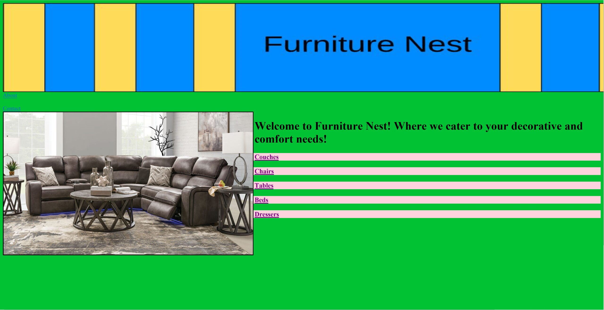
This for example, is a mock store homepage created to practice designing a clean and organized layout for a retail website. The project emphasized arranging content for easy scanning, maintaining visual consistency, and experimenting with typography and spacing to create an appealing interface.
About Me
I create user-focused designs that solve real problems and delight people. My process blends research, collaboration, and thoughtful iteration to turn complex challenges into simple, elegant solutions. Outside of designing, I love improvising my ideas on the fly, exploring new concepts, and experimenting with digital experiences in unexpected ways.